Voyage · Flavor · Discovery
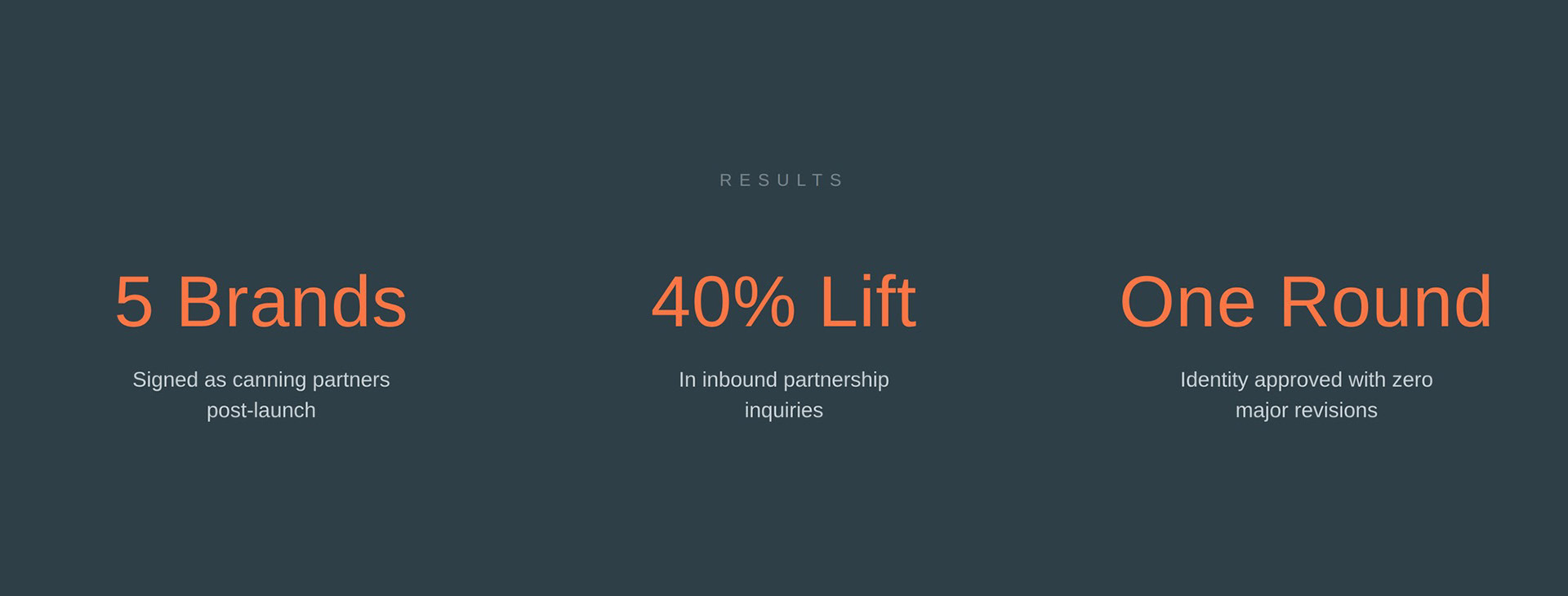
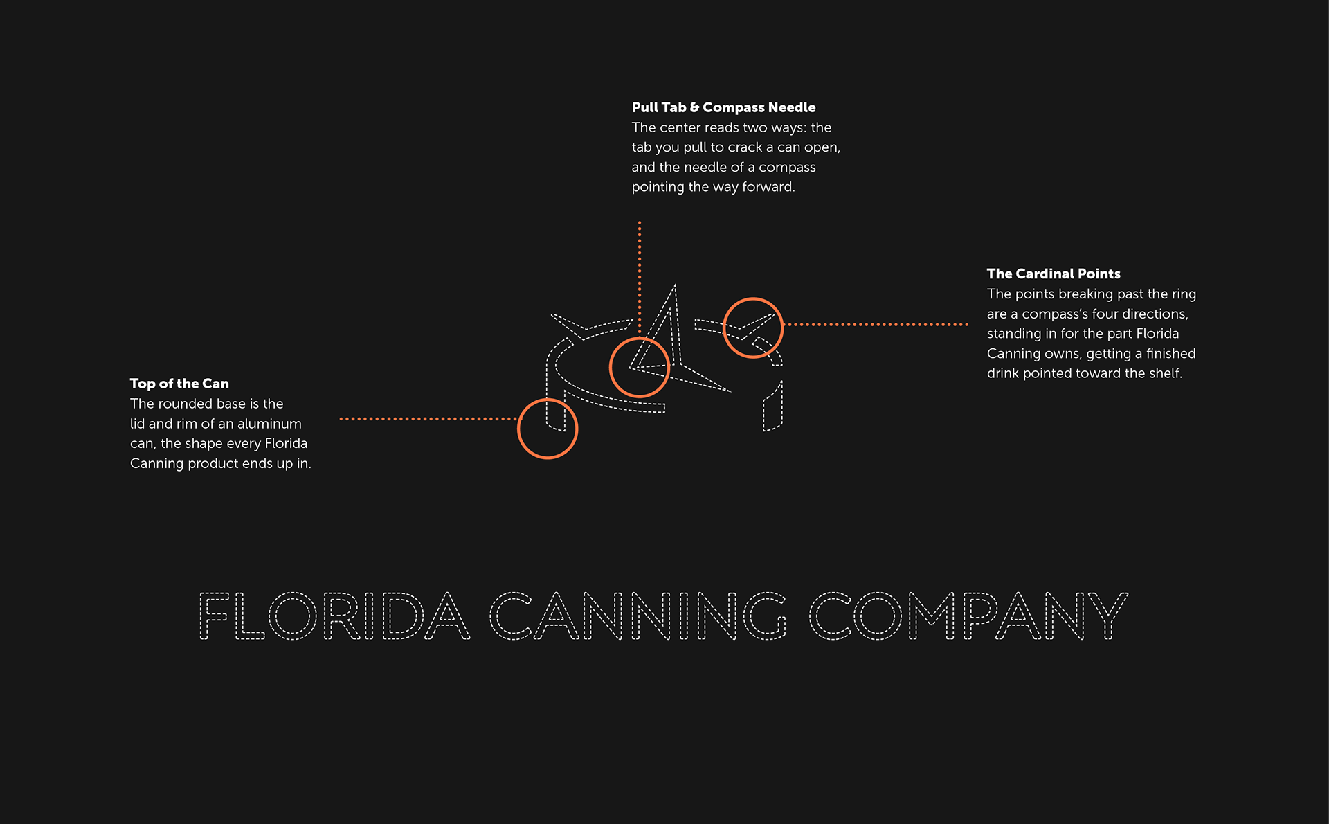
Florida Canning Company cans other people's drinks. They're a white-label beverage producer in Lake Park, just north of West Palm Beach, and their pitch is about as blunt as it gets: if you can craft it into a beverage, they can can it. Bring a finished recipe or just an idea. They run the whole thing, make it, package it, refrigerated storage, distribution. I built their brand identity: a system meant to make a behind-the-scenes manufacturer feel like a partner you'd put your name next to.
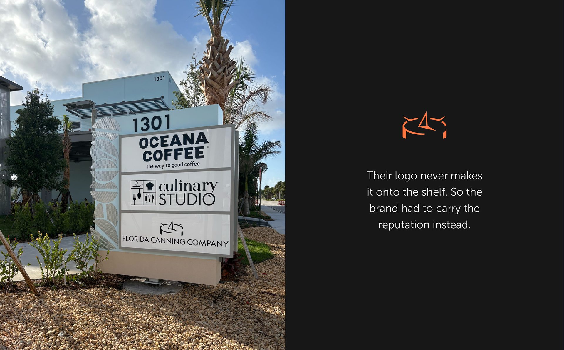
Challenge: White-label canning is invisible by design. They make other brands look good, so their own logo never hits the shelf. The brand had to carry a reputation the product never gets to show.
Goal: A full identity, built from scratch, that looked as capable as they are, precise enough to trust with a recipe, and built to scale from a can lid to a building sign.
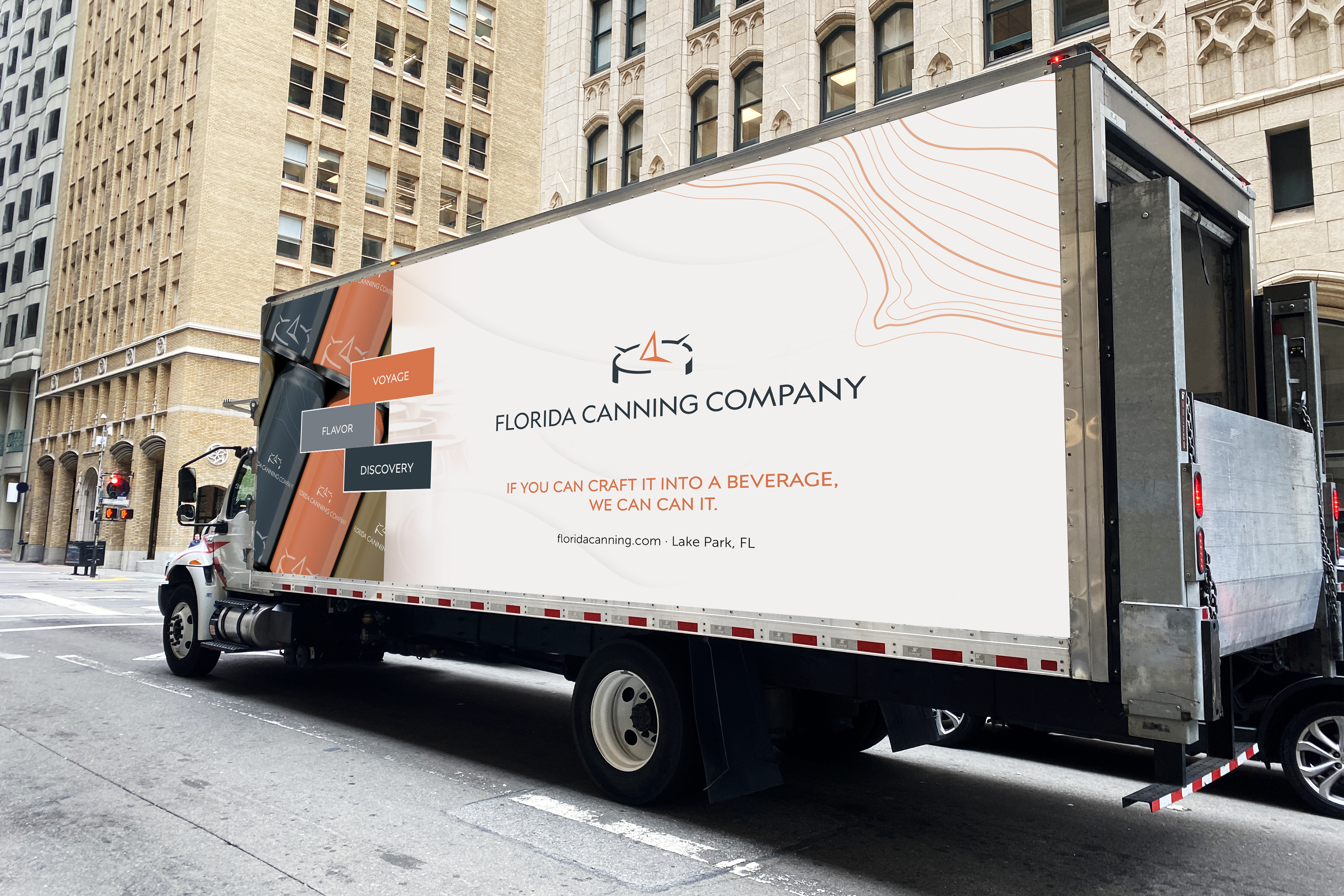
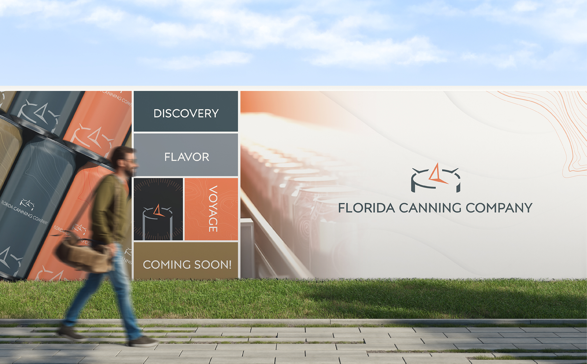
Built as a moving billboard for a company most people never see, the wrap maps the compass to a route, Voyage (make it, can it, ship it), Flavor (the product), and Discovery (found on the shelf), pointing the same way the mark does.
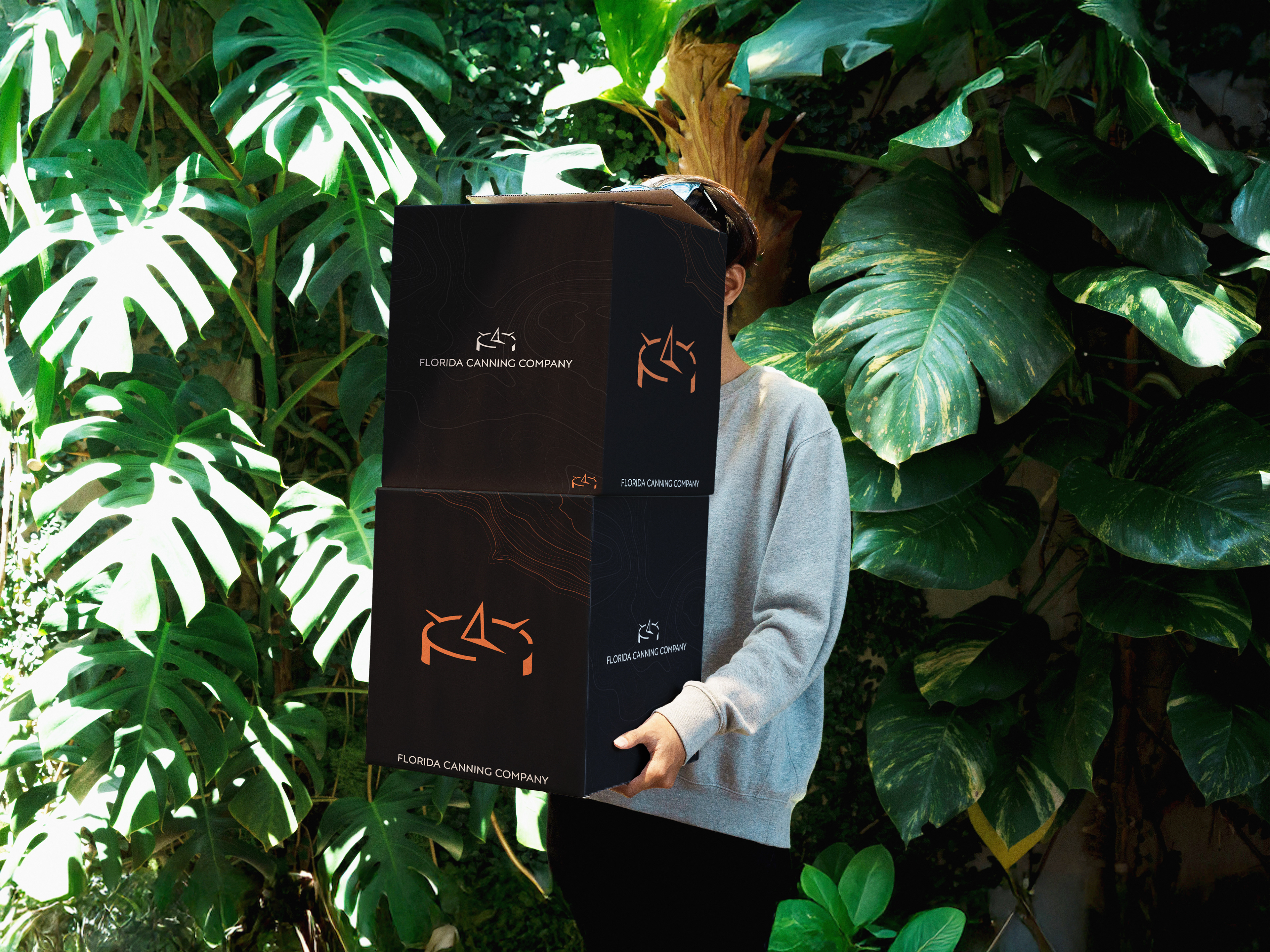
The case ships out into the world with the product inside, so the mark and the contour lines, a nod to the compass and to charting a route, cover every face. It's the one place the behind-the-scenes manufacturer gets their name on something that leaves the building.
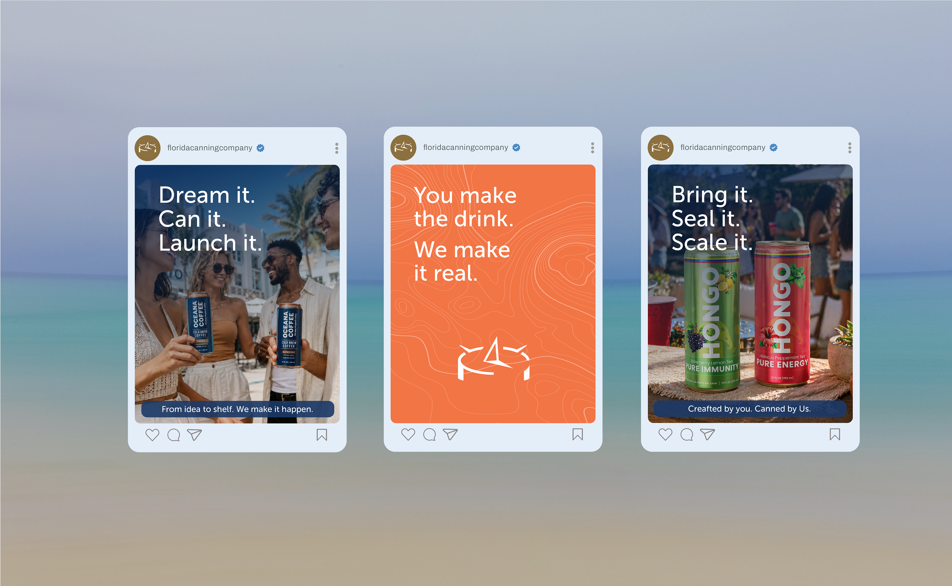
The whole campaign turns on one word, it, with a repeatable three-beat headline (Dream it. Can it. Launch it.) that keeps every post on-brand without a redesign. Product shots and type-only brand posts trade off across the grid, each caption adding a line rather than echoing the headline, so the system scales as fast as they post.