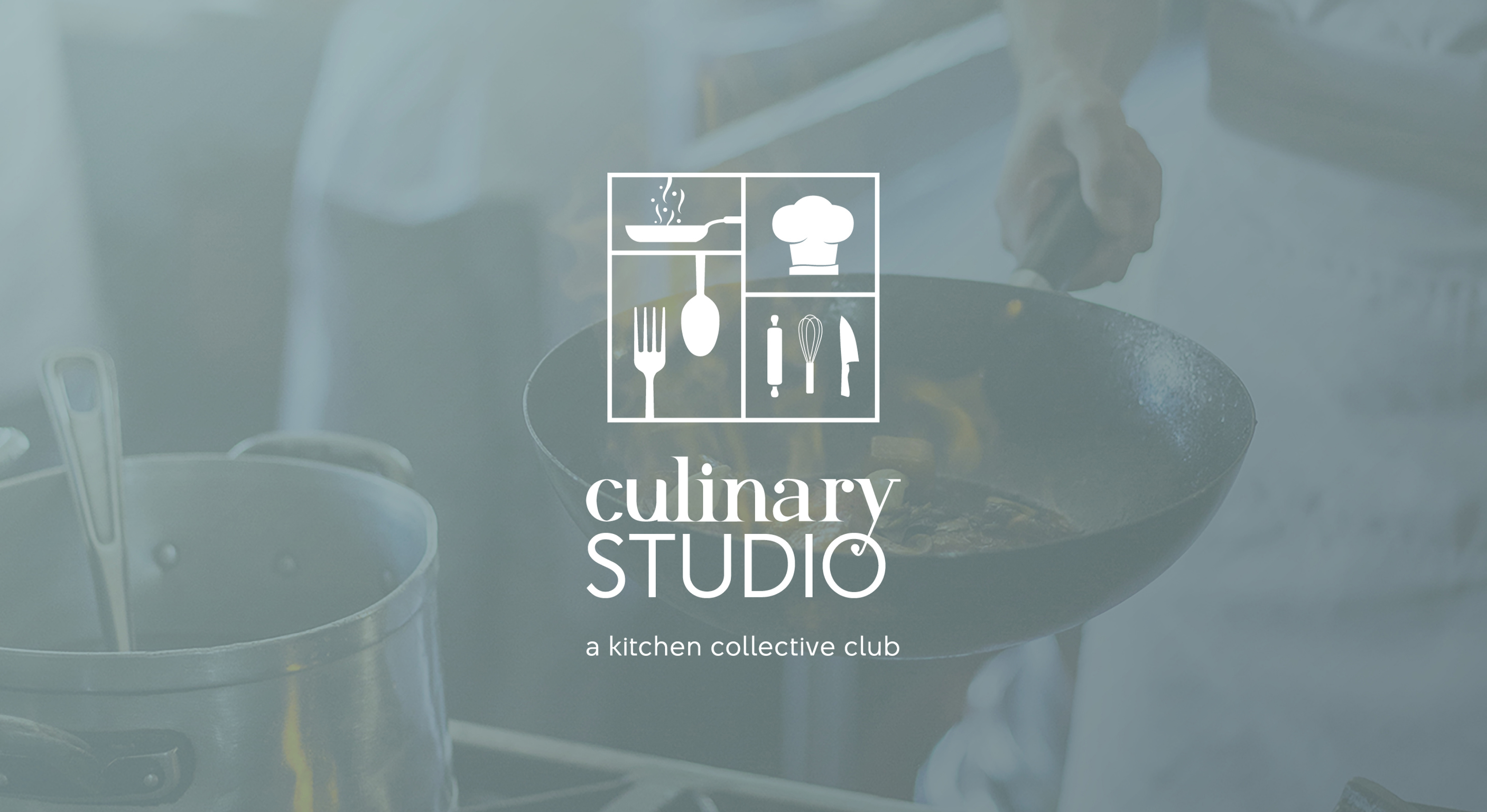
Culinary Studio is a membership kitchen in Palm Beach County. It gives caterers, food truck operators, aspiring restaurateurs, and delivery-only food businesses access to fully equipped professional studios without the cost of building their own. Members pick a plan, apply, and book time in shared kitchens or private VIP suites. The company was founded by restaurant industry operators who understood the gap firsthand, and it opened as the first facility of its kind in the area.
I came in at the start, before the brand existed. There was a business model and a building under construction. Everything a customer would eventually see, I designed.
CHALLENGE
Co-cooking was a new idea for this market. Most people had never heard of a shared commercial kitchen, so the brand had to teach the concept and sell it at the same time. It needed to read as professional and credible to working chefs who would measure it against the real kitchens they already trusted, while staying open and approachable to first-time food entrepreneurs who found the industry intimidating.
It also had to work before the doors opened. The first impression was a construction site, so the brand had to land on outdoor hoarding and signage long before anyone could step inside.
MY ROLE
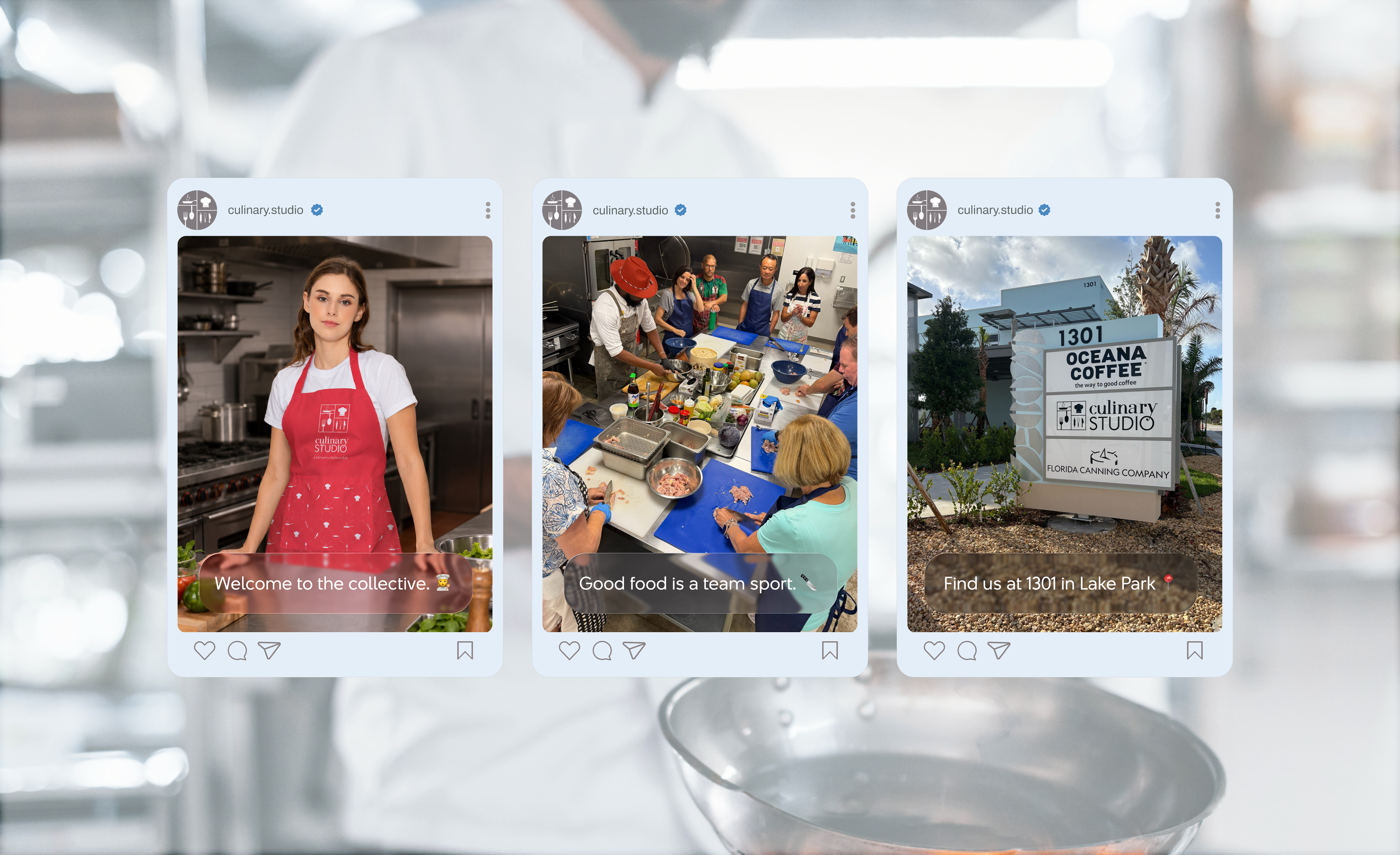
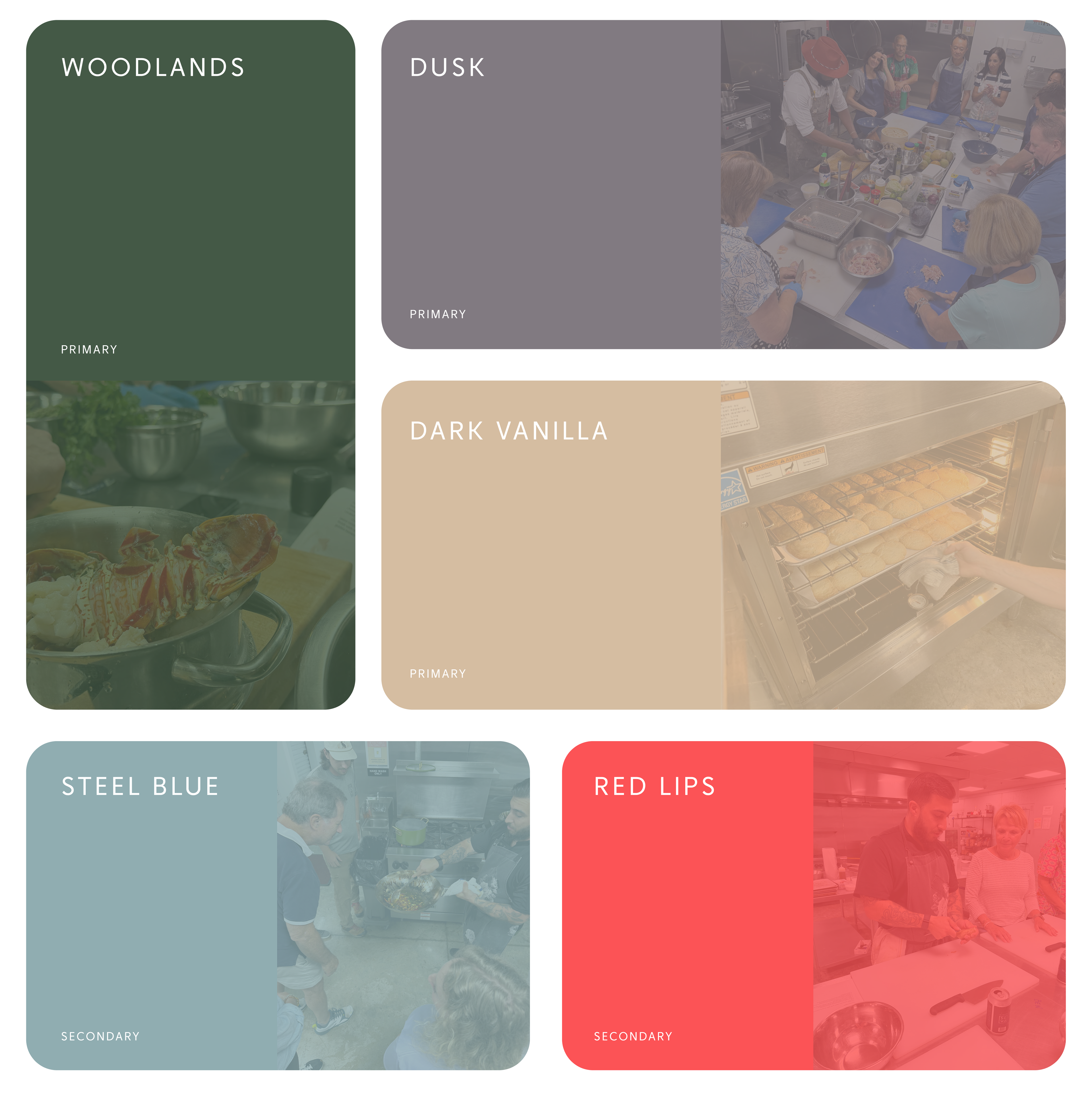
Sole designer, end to end. I owned the strategy and every asset that came out of it: the logo system, the color palette, the brand guidelines, the outdoor wayfinding and hoarding signage, the membership collateral, the application mockups, and the identity for the studio's first major event, Culinary Clash.
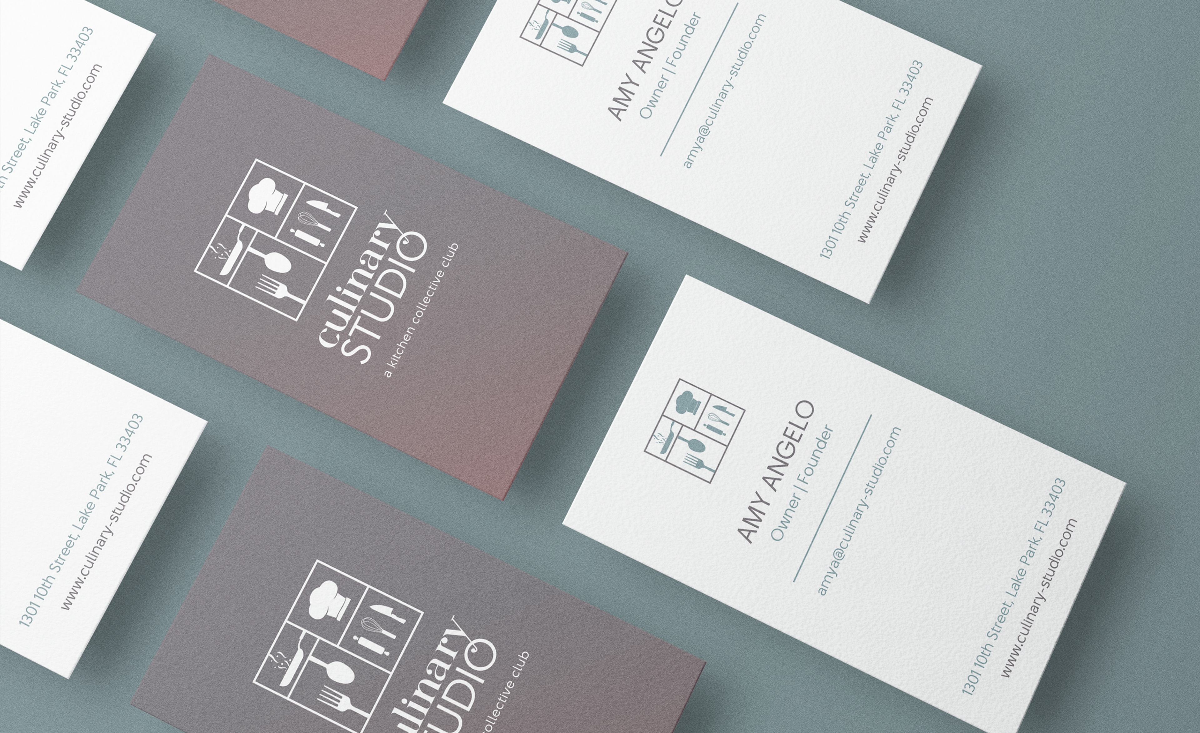
I ran the founder's cards vertical to stand out in a stack of standard landscape cards, and duplexed them so the back carries the reversed mark on a brand color while the front stays white for contact details. It is a small surface doing two jobs: the colored back is unmistakably Culinary Studio across a room, and the white front keeps the details easy to read up close.
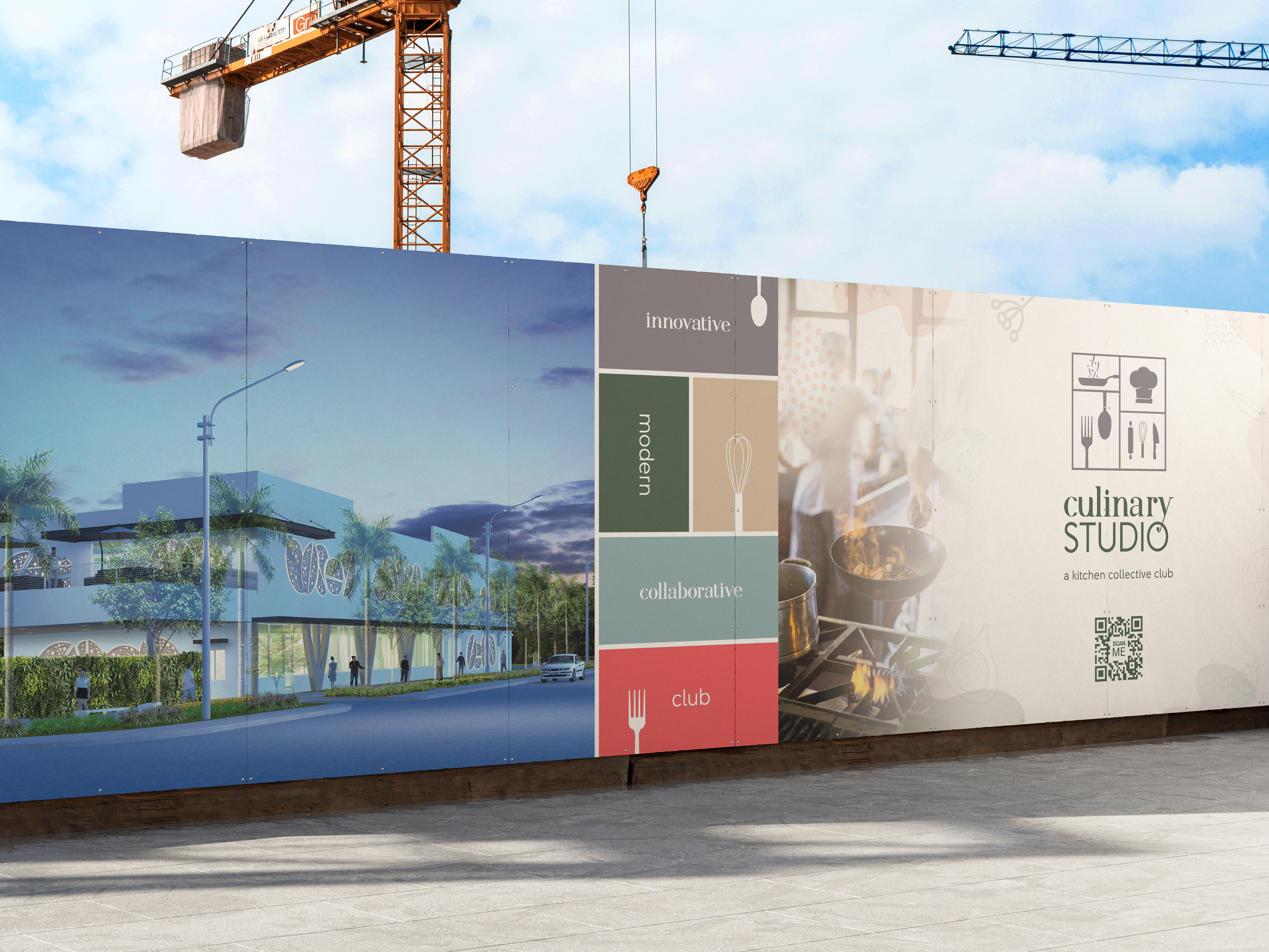
With the building still under construction, the site barrier was the brand's first public statement, so I treated the hoarding as marketing instead of fencing. The architectural render sells the future space, the stacked attribute words (innovative, modern, collaborative, club) carry the positioning at a glance, and a QR code turns a plywood wall into a way to join before the doors open.
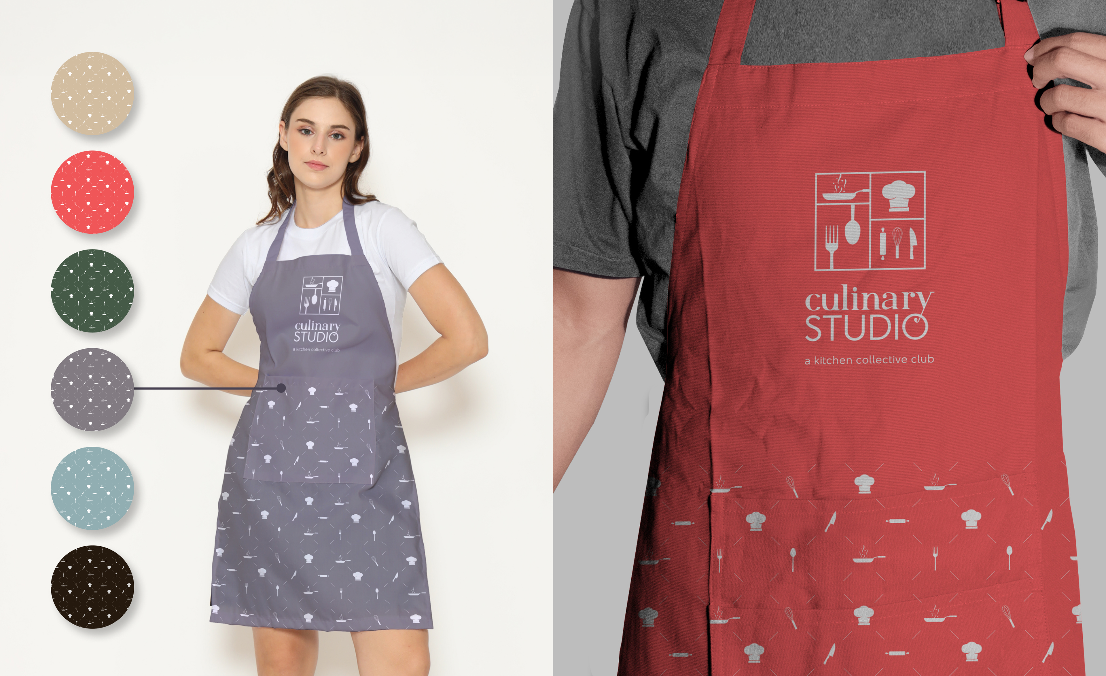
I drew the secondary pattern from the same icon set as the logo, so the brand reads as one system whether you are looking at the mark on the chest or the scattered utensils across the hem. The apron is a working member's most worn touchpoint, so I produced the pattern in all six brand colorways to give the team range across merchandise without ever stepping outside the palette
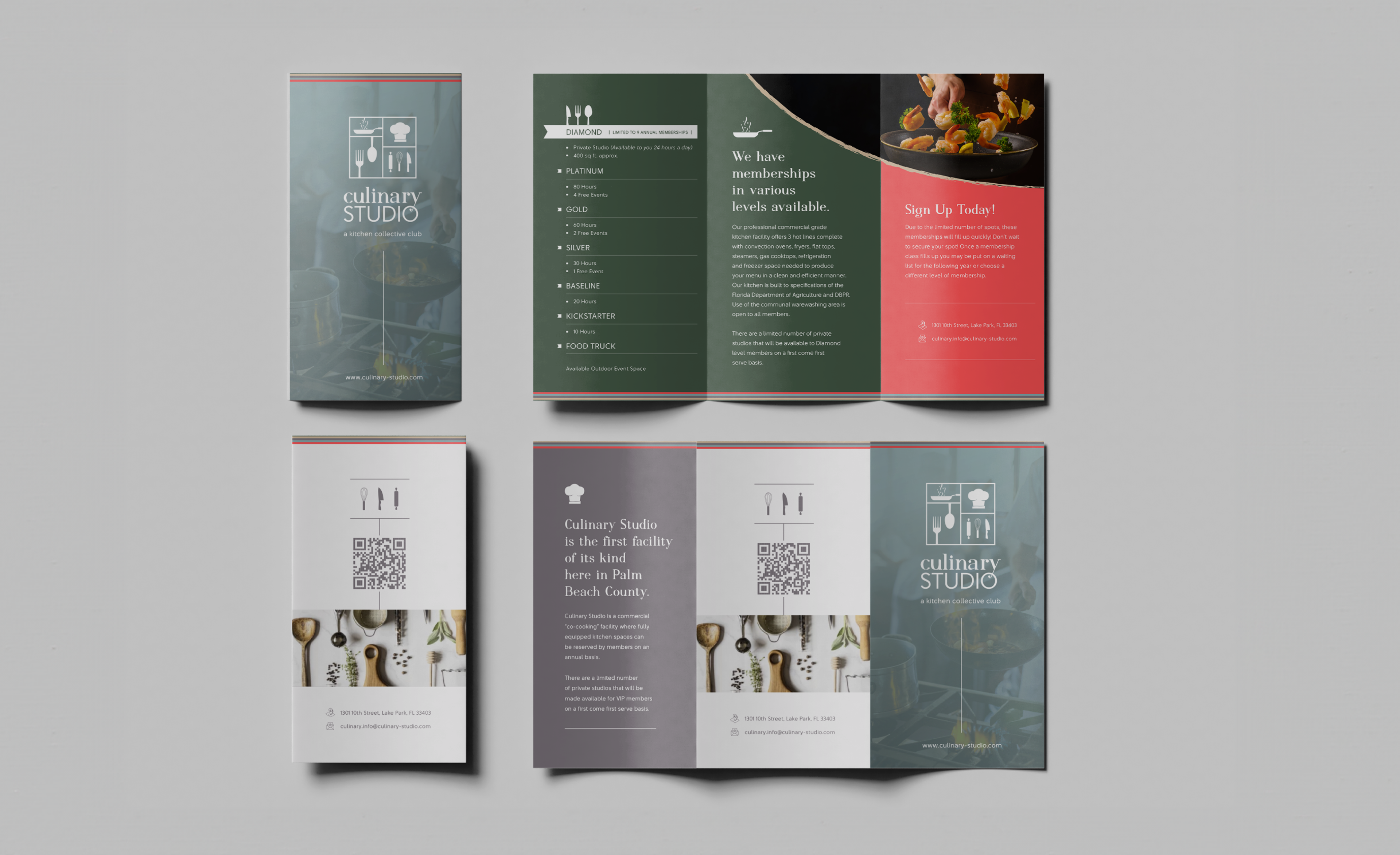
The trifold had to sell a membership model most people had never encountered, so I structured the interior around one clear hierarchy: the tiers down one panel, the offer in the middle, and a red call to action where the eye lands last. Every level, Diamond through Food Truck, sits in a scannable list so a prospective member finds their fit in seconds, and the duotone food photography keeps even the imagery inside the brand.